
Bringing the Pac-Man logo back was a big step forward although it's been surrounded by the widespread (in the NBA at least) circle/seal trend. The hawks needed to evolve it per league rules but probably took it too far to the point where it's more cartoon than line art.

We ditched the circle and created an evolution of the original Pac-Man hawk that includes the good from the new logo—a more predatory stance, more aggressive beak, etc.—with the stylistic qualities of the old one. We also created a custom logotype that gets back to the voice of the famous hawks type from the Dominique era, but is specifically drawn to maximize the relationships of each letter pairing in ther logo.
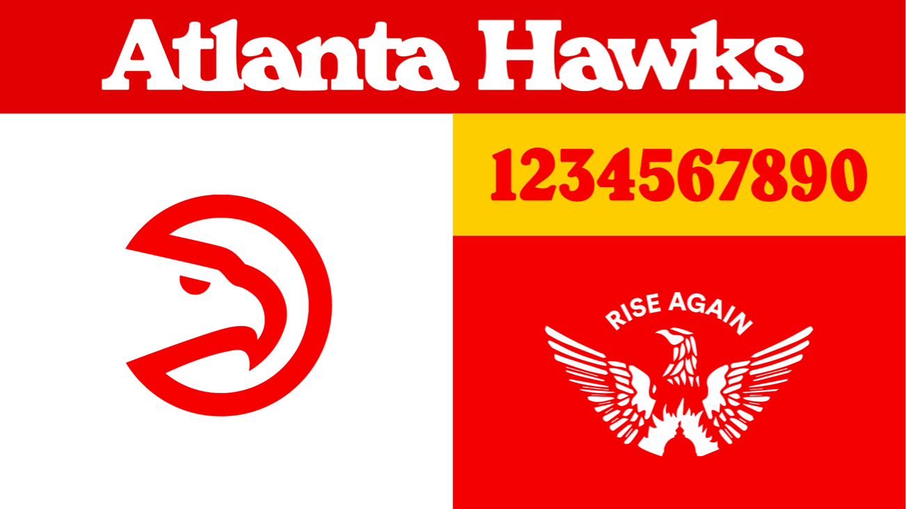
We extended the custom lettering to a number set, and simplified the colors to just red yellow and white. We also included a secondary logo: the phoenix from the Atlanta city flag, with the Georgia Capital silhouette engulfed in flames below it (symbolizing Atlanta's journey of progress, from being burned to the ground in the civil war, to now).
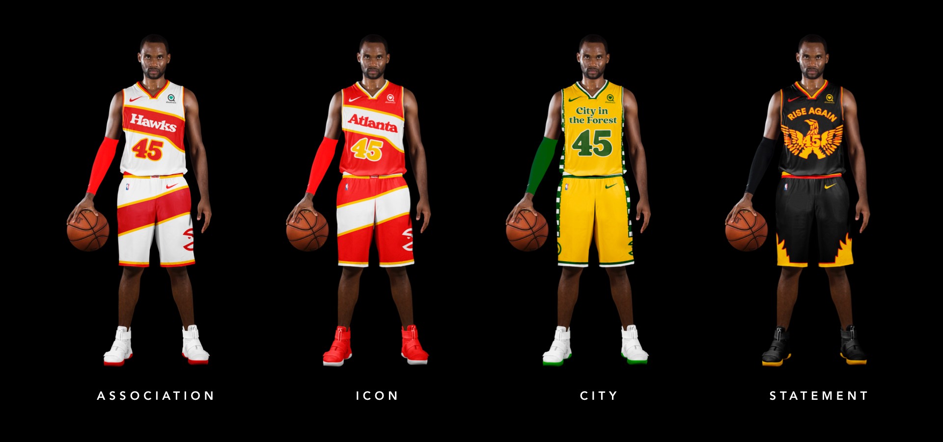
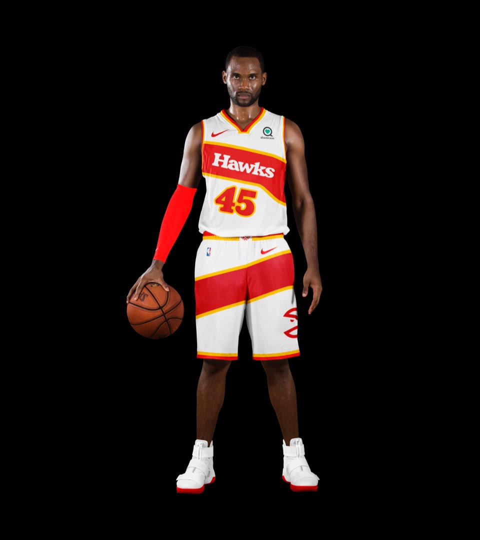
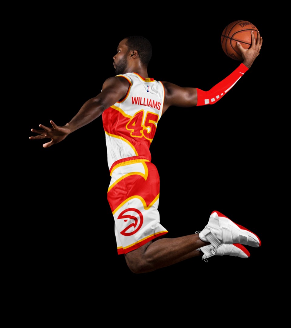
The association jerseys are a return to the Dominique style, but instead of a seemingly arbitrary angled line, we've injected more meaning into it by making the uniforms a giant version of the hawks logo.
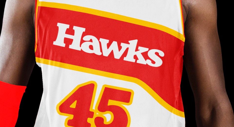
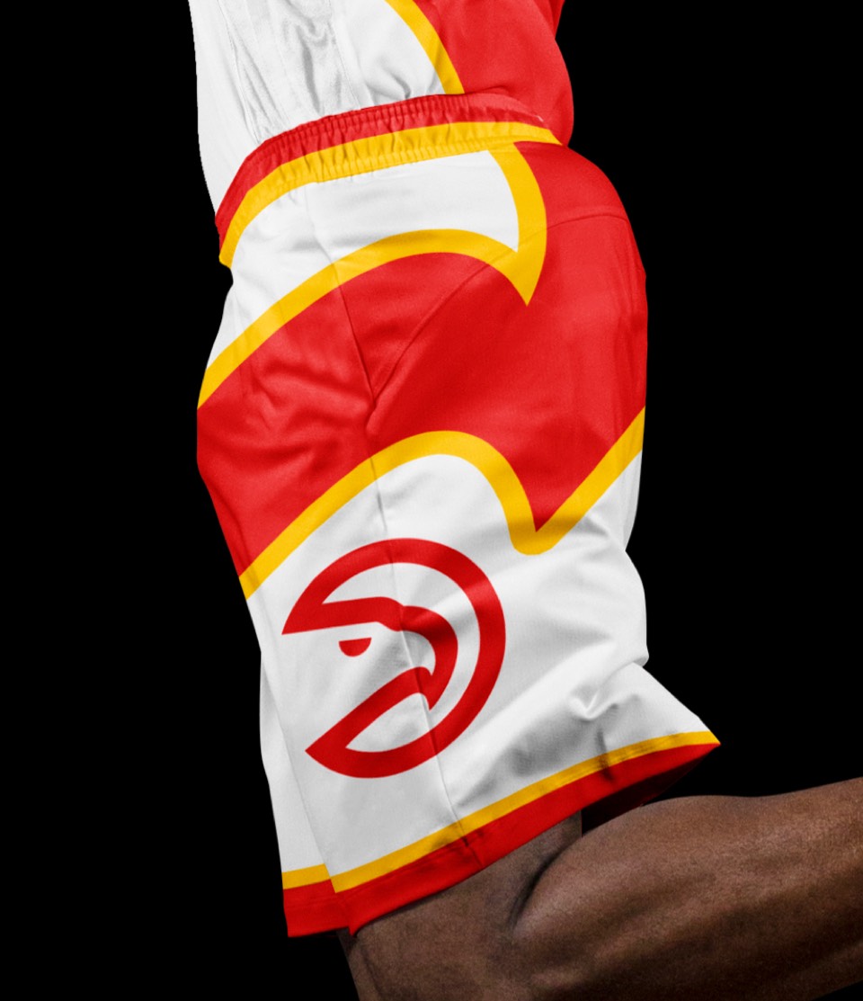
The association jerseys are a return to the Dominique style, but instead of a seemingly arbitrary angled line, we've injected more meaning into it by making the uniforms a giant version of the hawks logo.
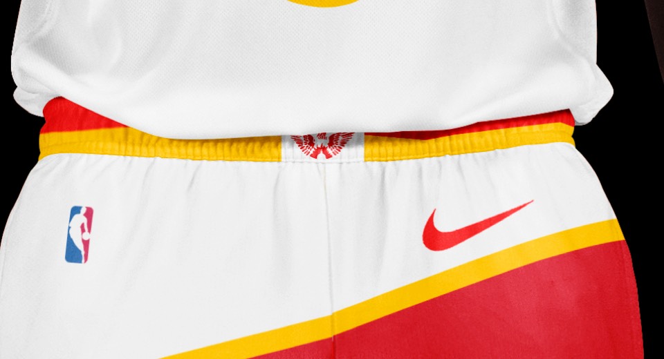
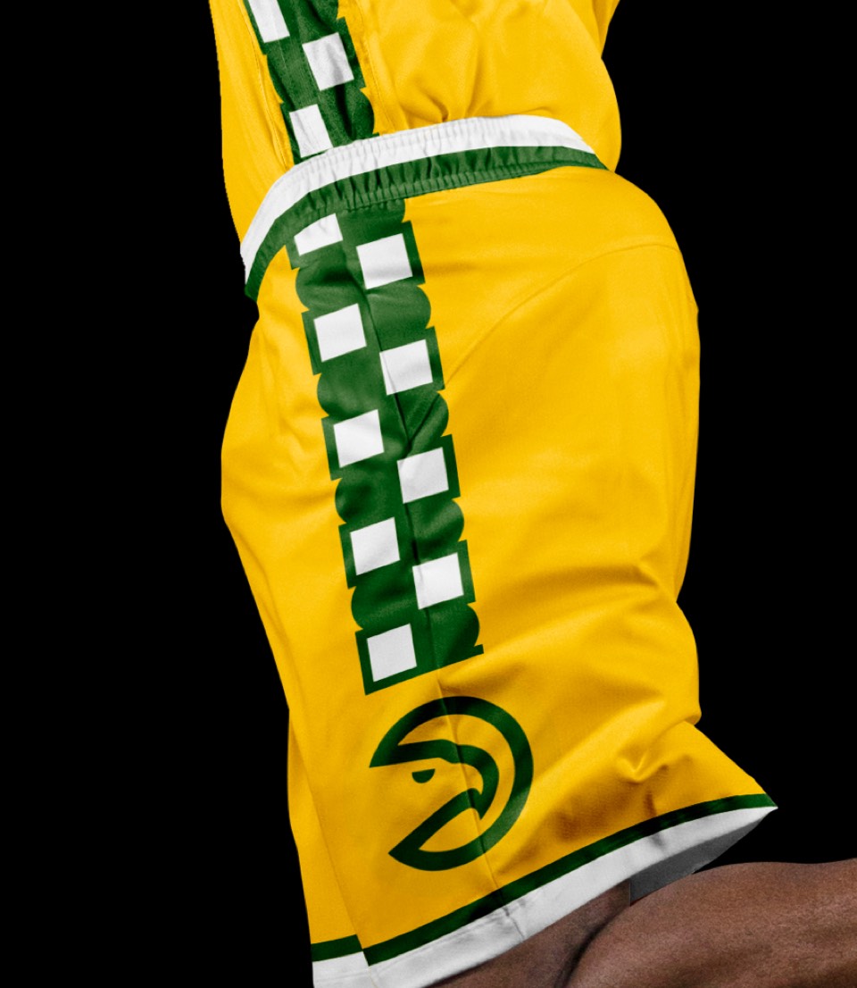
Instead of saying hawks for both icon/association like they used to, we're giving them a (formerly "away") jersey that says "Atlanta". We've also added the ATL Phoenix on the belt buckle.
Instead of saying hawks for both icon/association like they used to, we're giving them a (formerly "away") jersey that says "Atlanta". We've also added the ATL Phoenix on the belt buckle.
Atlanta is known as the "City in the Forest" for how much tree coverage it has. We created an abstract pattern of trees and buildings in green, with the Hawks yellow as the primary background color.
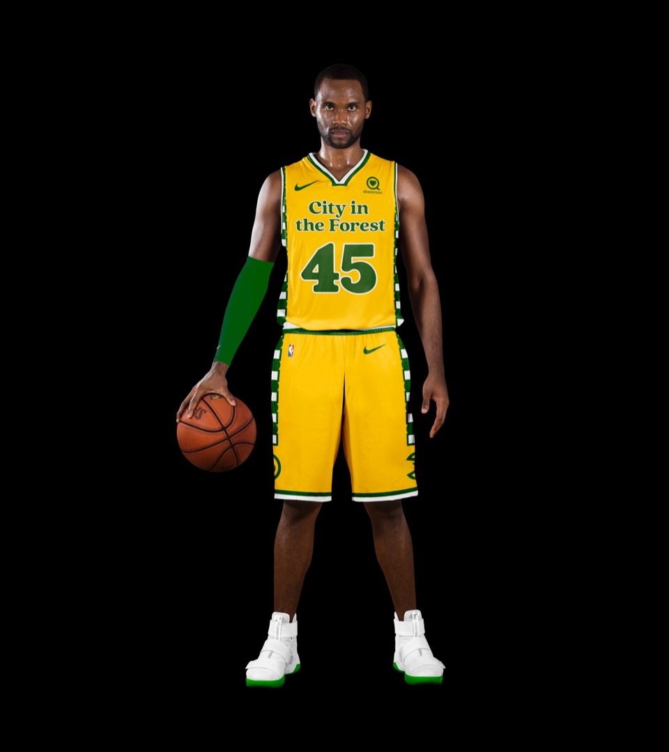
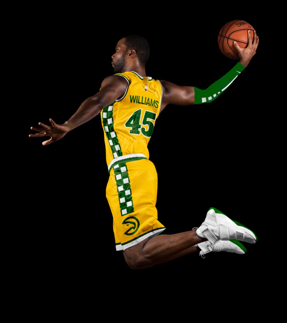
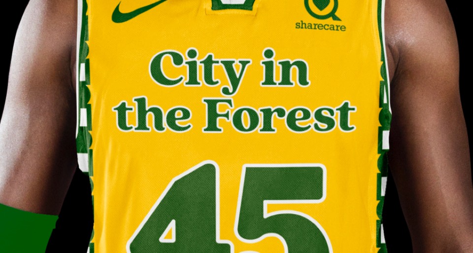
Atlanta is known as the "City in the Forest" for how much tree coverage it has. We created an abstract pattern of trees and buildings in green, with the Hawks yellow as the primary background color.
A tribute to the layout of the 90's black hawk uniform, in this case having the black represent ashes, swapping out the cartoon hawk with the phoenix logo and the RISE AGAIN translation from the state flag.
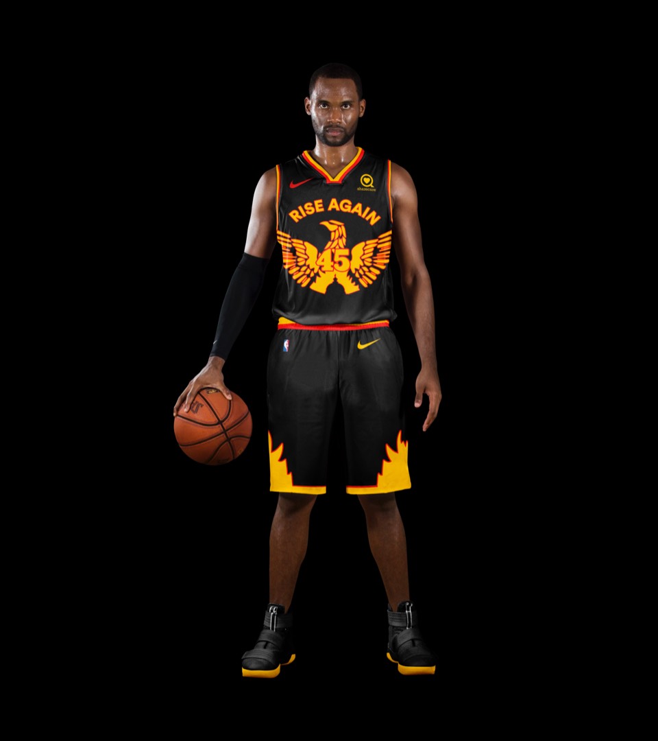
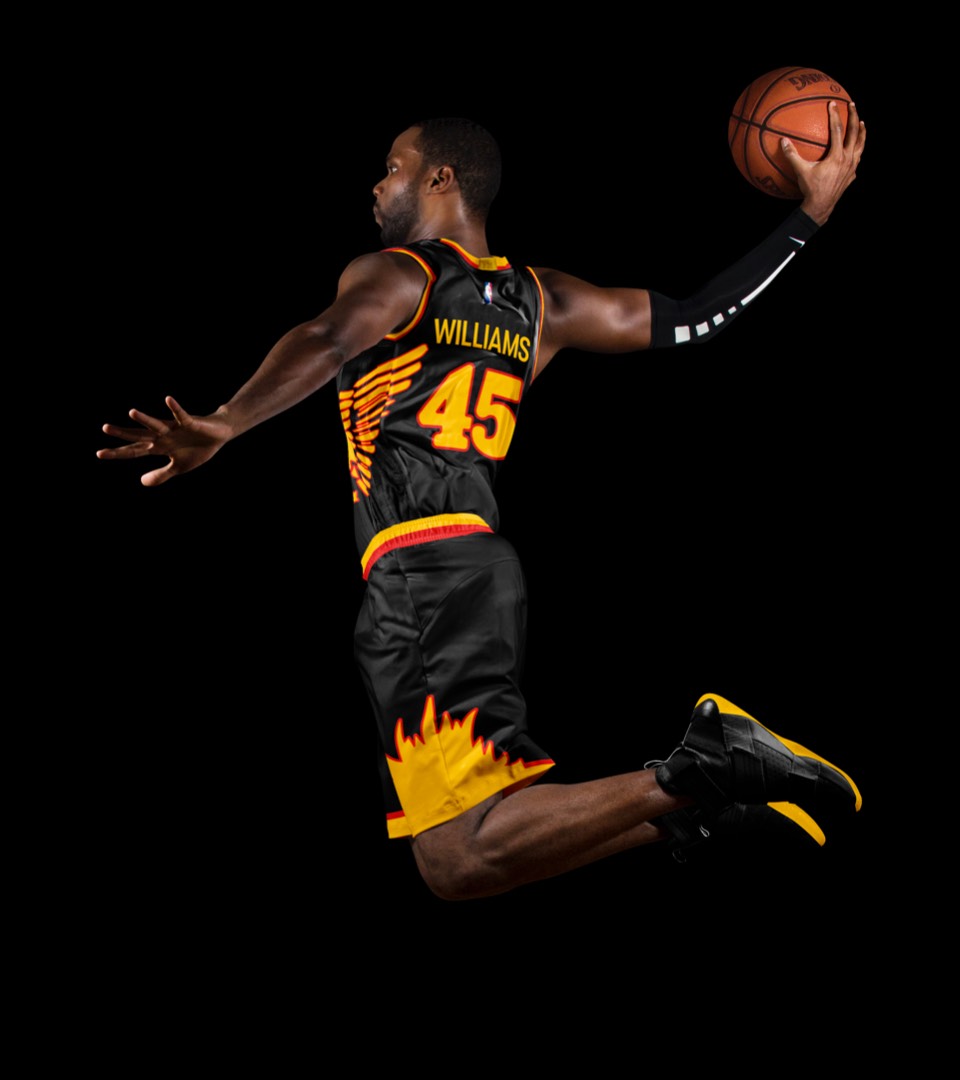
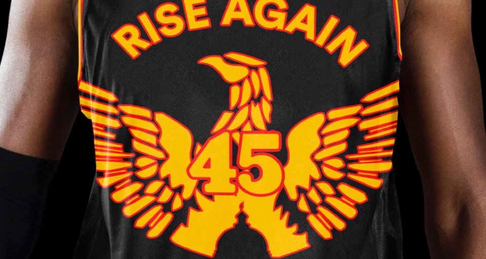
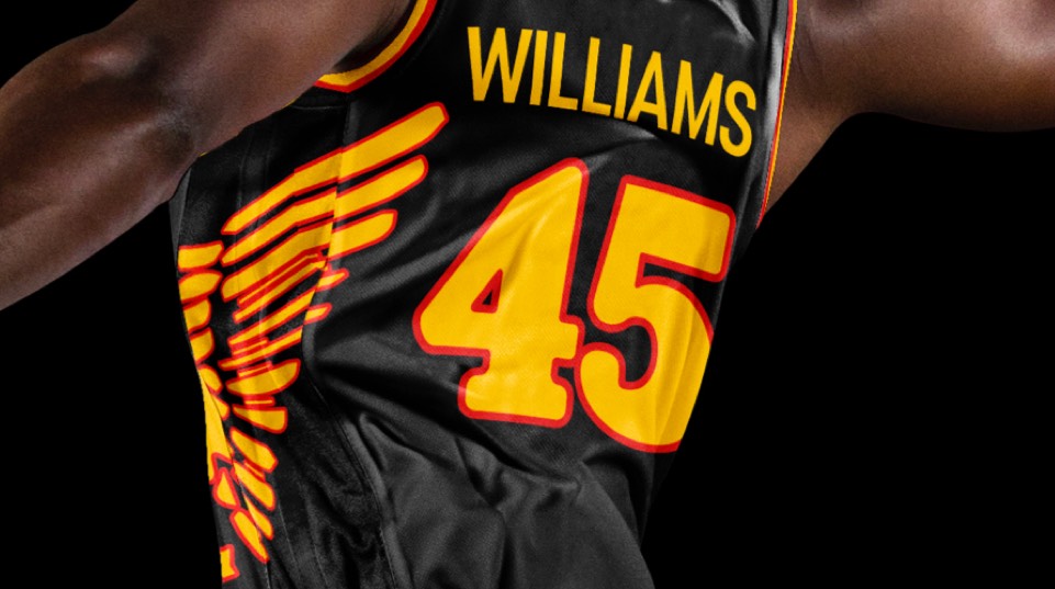
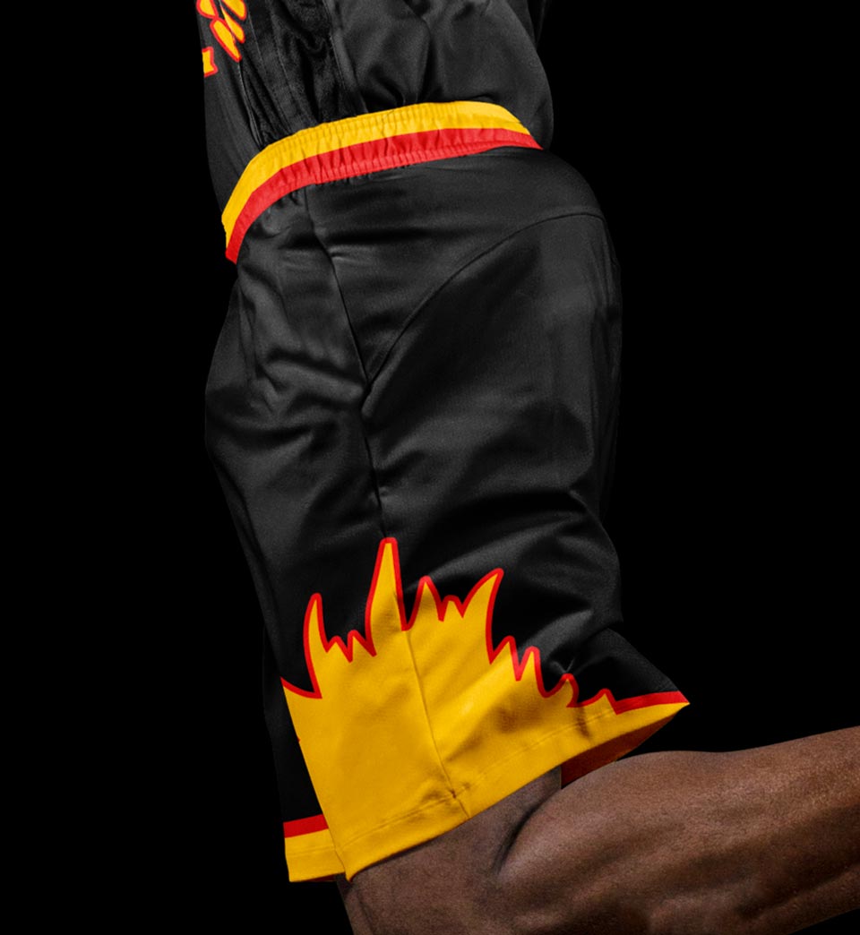
A tribute to the layout of the 90's black hawk uniform, in this case having the black represent ashes, swapping out the cartoon hawk with the phoenix logo and the RISE AGAIN translation from the state flag.