
This one is a tough/painful one given that the Jazz logo in a vacuum is maybe one of the best sports logos ever. We considered moving it back to New Orleans but that would mean getting rid of the Pelicans name which we didn't want to do. In listening to the Jazz fans, they're not against the name but there's a definite sense of, this doesn't reflect our state. We decided what the heck, let's see if, for UTAH, we can beat it.

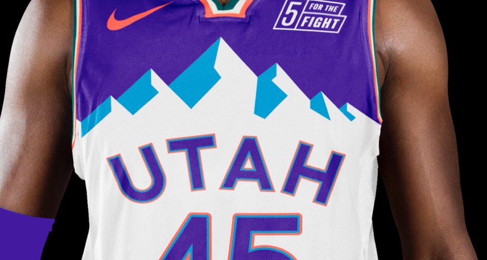
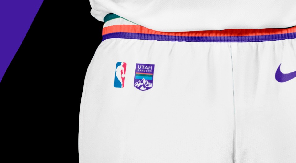
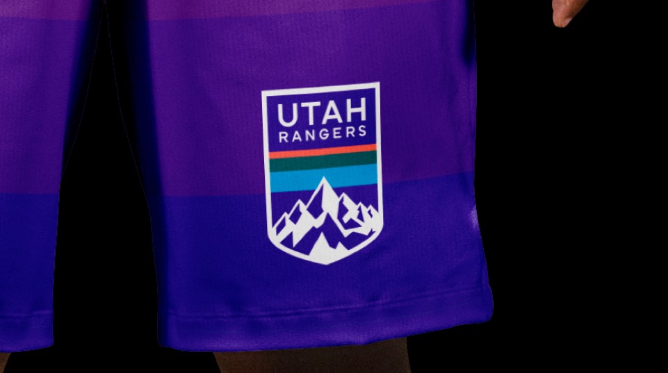
The Utah Rangers. Makes sense given the abundance of mountain ranges and national parks, and hints at the idea of "range" as in, shooting range. Plus it lends itself to a nice little motif of park-ranger-style badges. Most importantly, we're bringing back an evolved version of the mountain range color palette and the iconic mountain graphics!
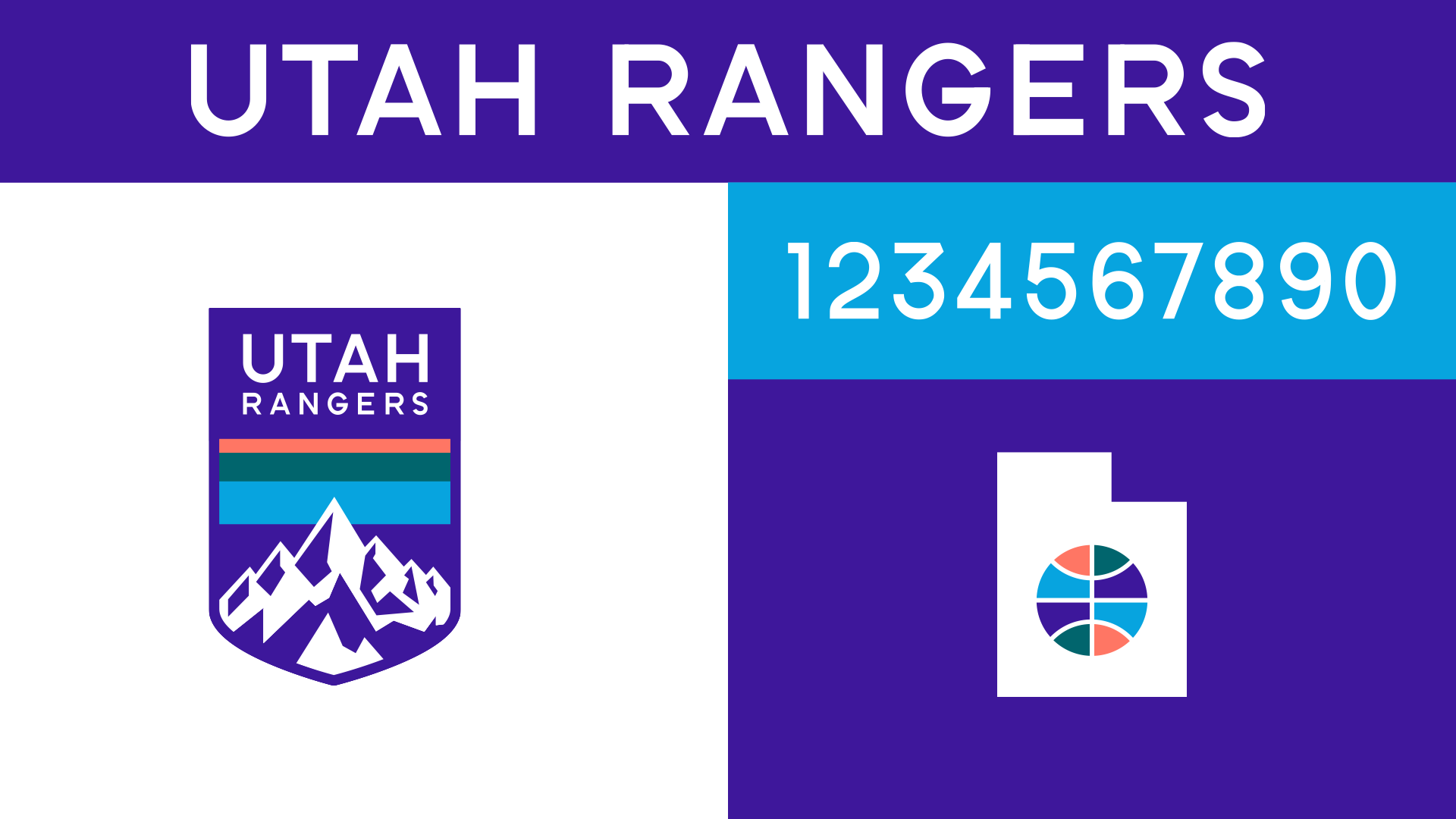
The type is trying to be as transparent as possible, idea being to get the heck out of the way and let the mountains be the hero (seems like the approach for the NPS branding too so, feels connected). And we're keeping the multi-colored ball from the Jazz logo, but placing it in a silhouette of Utah, the coolest most minimalist state graphic.
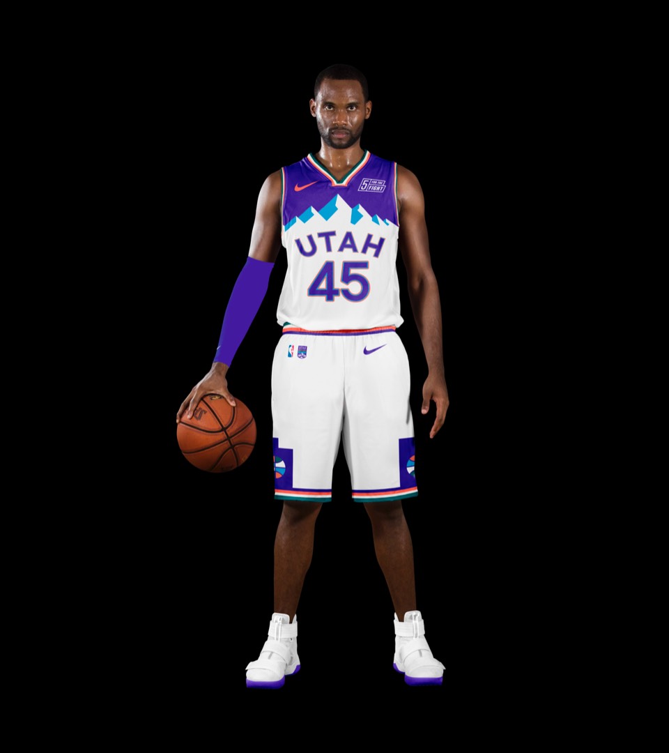
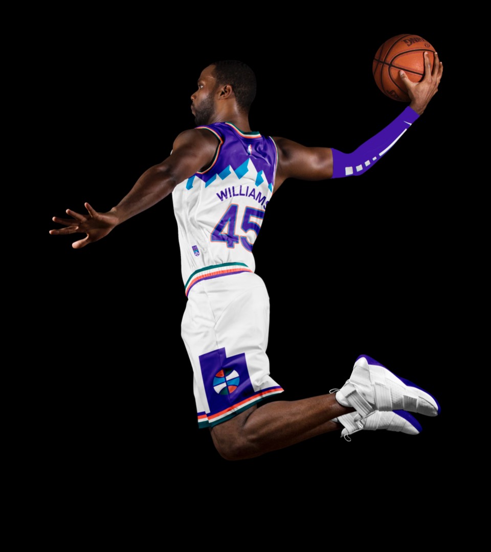
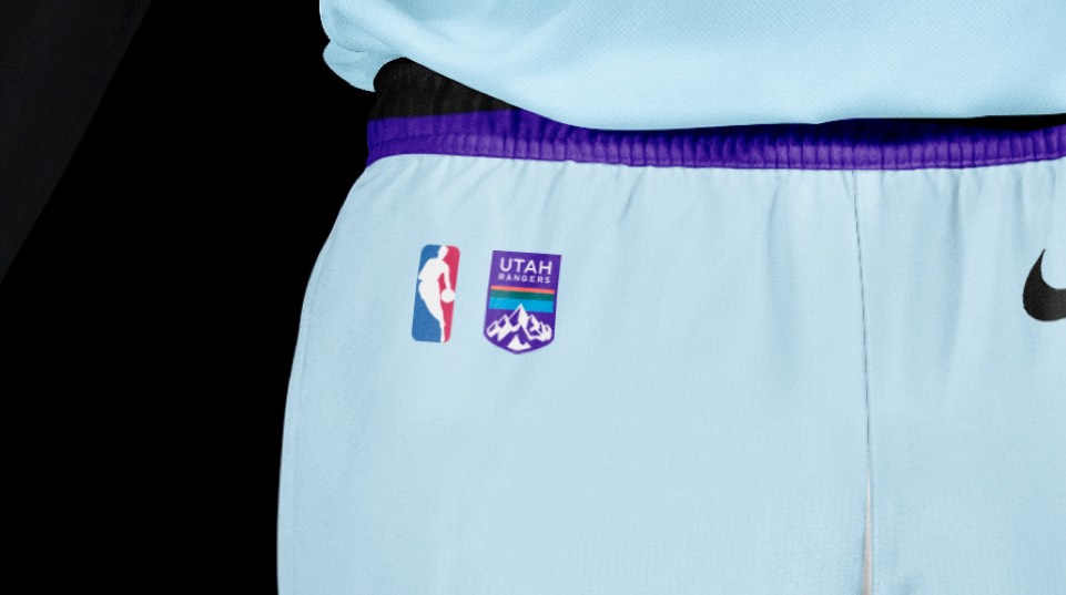
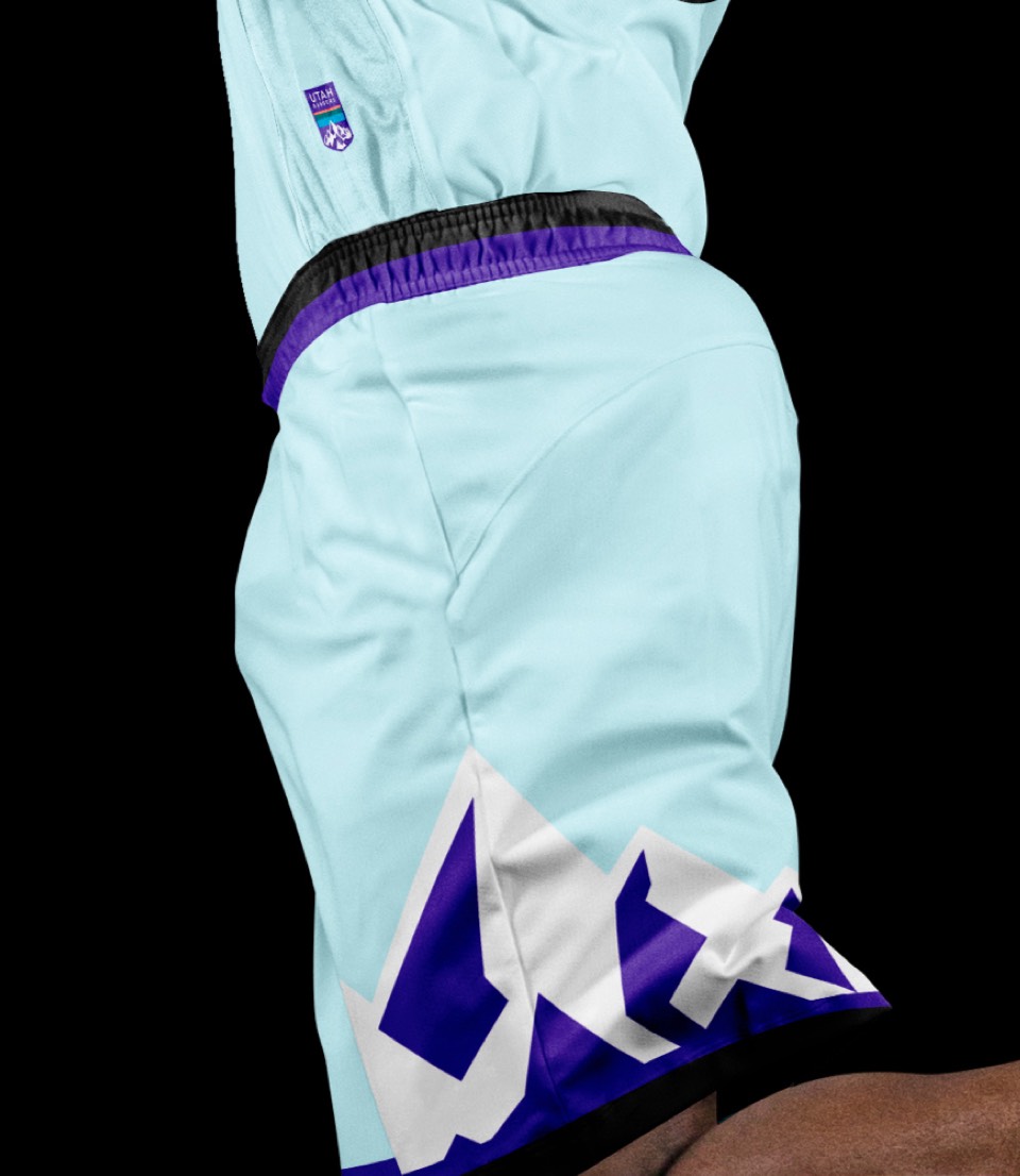
A cleaner take on the mountain range uniforms, ditching the gradients, using our cleaner numbers, and instead of repeating the asymmetrical mountain range on the shorts, displaying the Utah basketball logo on each leg. The primary logo is embedded as a tiny patch (similar to outdoor adventure gear) on the jersey and shorts.
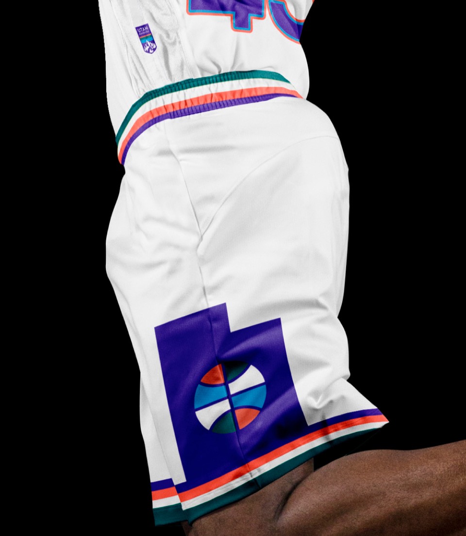
A cleaner take on the mountain range uniforms, ditching the gradients, using our cleaner numbers, and instead of repeating the asymmetrical mountain range on the shorts, displaying the Utah basketball logo on each leg. The primary logo is embedded as a tiny patch (similar to outdoor adventure gear) on the jersey and shorts.
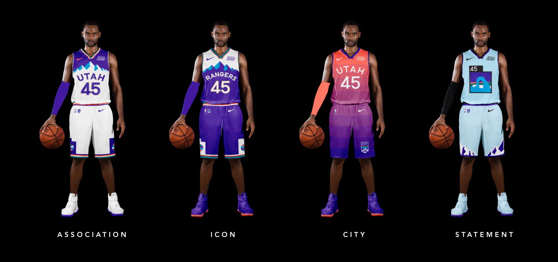
Crazy seeing "Rangers" here, right? If it's too crazy, we wouldn't argue with putting UTAH on all the uniforms. Just wanted to try it on for size and brace ourselves for the snarky comments.
Crazy seeing "Rangers" here, right? If it's too crazy, we wouldn't argue with putting UTAH on all the uniforms. Just wanted to try it on for size and brace ourselves for the snarky comments.
A tweak on the Red Rock uni's with the new color palette; a "Red Rocks at dusk" moment. Also featuring a larger logo patch on the left leg.
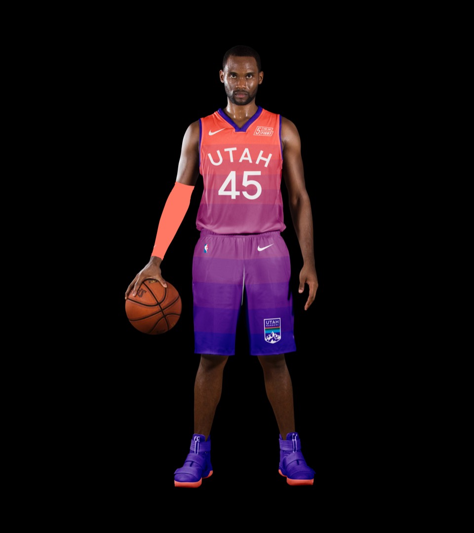
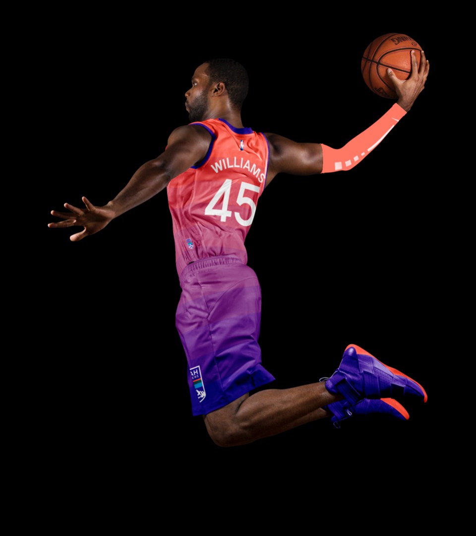
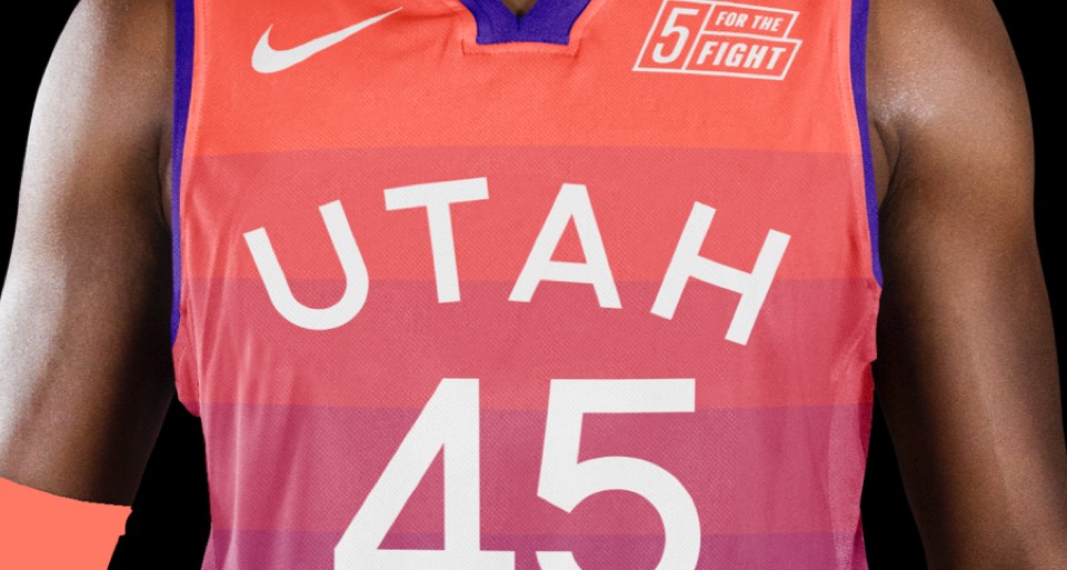
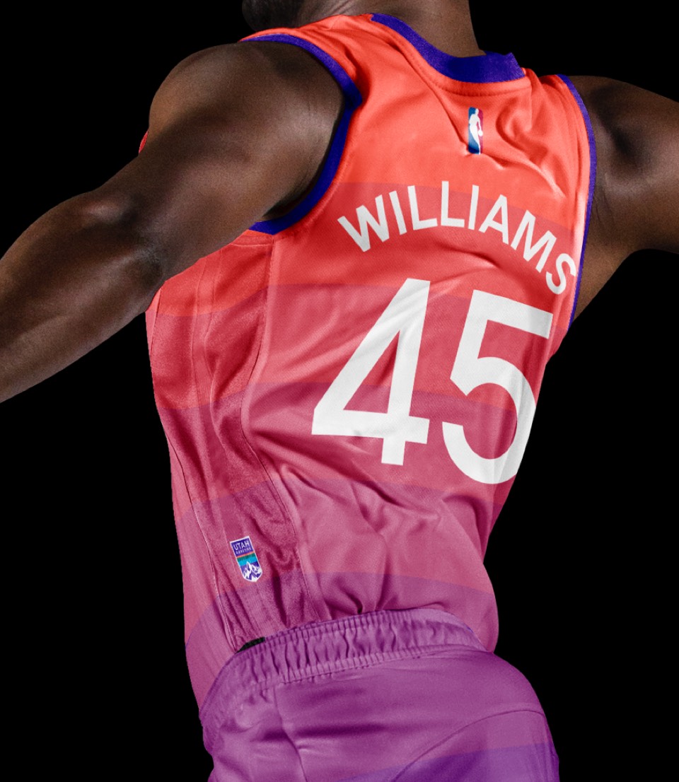
A tweak on the Red Rock uni's with the new color palette; a "Red Rocks at dusk" moment. Also featuring a larger logo patch on the left leg.
"The Mighty Five"—a tribute to Utah's five national parks, each player on the starting five could get a different park on their jersey (I guess if you're a bench player you can have your pick?). The black trim housing numbers and park illustrations are inspired by the Massimo Vignelli NPS visual identity system, and for this direction we've moved the mountain range to the shorts.
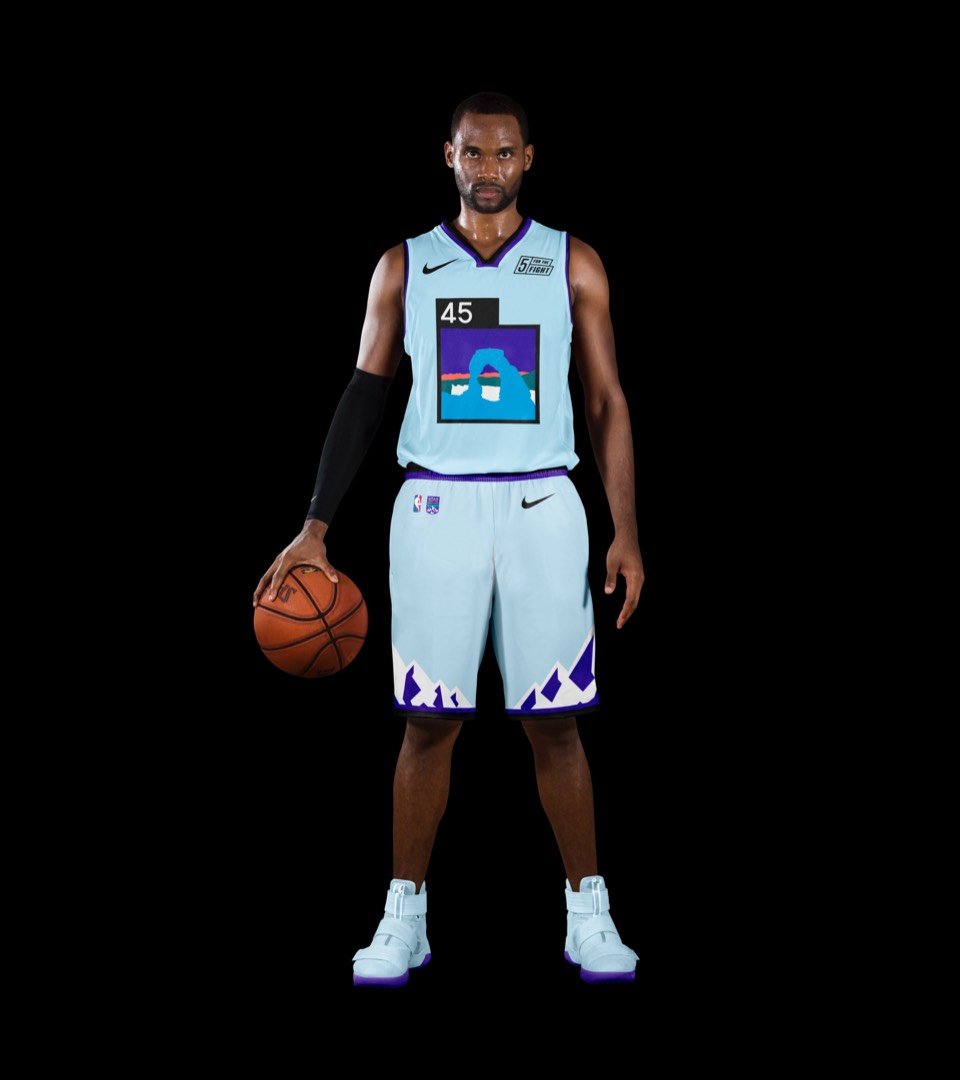
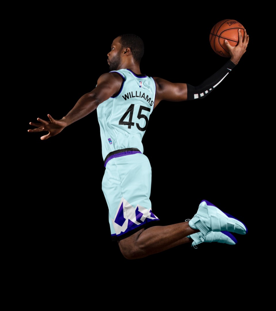
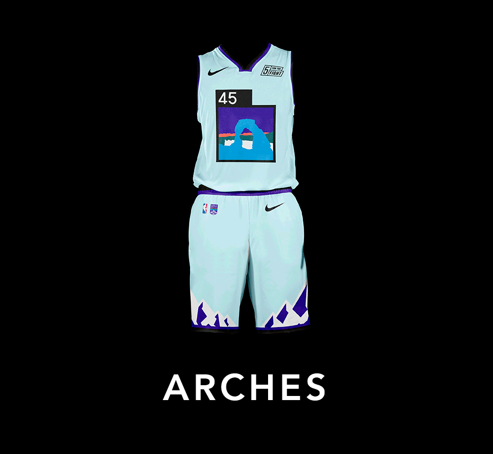
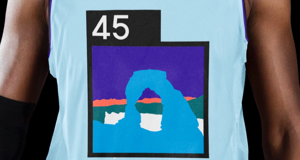
"The Mighty Five"—a tribute to Utah's five national parks, each player on the starting five could get a different park on their jersey (I guess if you're a bench player you can have your pick?). The black trim housing numbers and park illustrations are inspired by the Massimo Vignelli NPS visual identity system, and for this direction we've moved the mountain range to the shorts.